The Evolution of our Logo
This is the evolution of our logo.


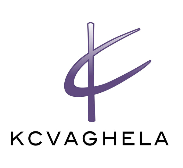
We started off in 2009 with this concept for KC Vaghela - to create a logo that was iconic and witty yet simple.
The logo was a line with an elongated C across it to make a 'K' and a 'C' at the same time!
We played around, moving the C rightwards until we got the most perfect positioning of the C to across the line.
Then we finalized our colour palette, black, white, grey and a beautiful shade of purple.
We love Purple because it's both masculine and feminine, a mixture of blue and pink. Purple represents creativity/innovation, independence and power. Elements we carry in our brand but also character traits of our target audience.
We used logo 3 for almost 9 years until this last year (the one before Covid!) The KC symbol started gaining traction being seen solely on our caps and sunglasses worn by our Brand Ambassadors. People recognised the symbol but didn't know what to call it except for what they read below it and started calling it Vaghela brand (not knowing that the symbol was the actual KC). So we annotated it to say KCVaghela below.
This is much more personal and representative of our designer Kaajal.
Logo created by the talented Rajan Jangda